How to Add Text to a Photo in Five Steps
Quick answer: open your photo in the editor above, press Text, type on the picture, style the words and press Download. It costs nothing, asks for no account and stamps no watermark on the result. Everything is processed here itself, nothing is uploaded to our servers. The saved file keeps the full resolution of the photo you started with.
The whole job takes about two minutes. Step four is the one other tools skip.
- Open your photo. Drop a photo onto the editor, pick one from your device or paste one with Ctrl+V. JPG, PNG, WebP, GIF, BMP and AVIF all open. The canvas starts at the photo's own pixel size, so the editor shrinks nothing before you begin.
- Add your words. Open the Text tab, choose Heading, Subheading, Body or Caption and type straight onto the photo. For a head start, the Templates tab holds 20 ready layouts such as Meme, Quote Card and Corner Watermark, with every word and shape still editable.
- Style the text. Pick one of 112 built-in fonts or search 1,946 more open-source families. Set a colour or a gradient, then add an outline, a shadow, a box behind the words or a curve. Tapping one of the 20 one-tap styles, such as Neon or Gold Foil, restyles the selected line in one go.
- Check that it reads. Press Contrast on the selection toolbar. The meter reads the photo pixels under your letters and scores the worst of them against 4.5 to 1 for normal text and 3 to 1 for large text. If the score falls short, one tap adds an outline, a shadow, a box or a scrim. Another switches the text to whichever of black or white reads better. Posting a Story? Turn on Safe zones to see which edges to keep clear.
- Download it. Press Download and choose PNG, JPG or WebP. JPG and WebP get a quality slider. The file comes out at the photo's full resolution with no watermark and no sign-up. It carries the name add-text-to-photo-collagephotoapp.com and saves straight to your device.
The editor keeps its nine tabs in a rail on a laptop: Templates, Text, Elements, Photos, Style, Layout, Size, Layers and Batch. On a phone the same tabs move into a dock along the bottom of the screen, where a thumb can reach them. Undo, redo, zoom, the Safe zones switch and Download stay in the top bar on both.
There is no email box and no counter of free saves left today. Nobody asks you to create an account halfway through. Close the tab when you finish and no copy of your photo sits on any server, because none was ever sent.
What the Editor Can Do With Words
The full editor runs right here, above this article. Nothing below sits behind a price, a login or a trial. This is the complete list.
- 20 editable templates, including Meme, Quote Card, Corner Watermark, Tiled Watermark, Story Headline and Thumbnail
- 20 one-tap text styles such as Neon, Gold Foil, Glitch, Retro 3D, Highlighter and Arc Badge
- 112 built-in fonts: 12 system fonts plus 100 open-source families served from collagephotoapp.com
- Search 1,946 more open-source font families, each downloaded only when picked
- Use your own .ttf, .otf, .woff or .woff2 font file without it leaving your device
- Solid or two-colour gradient fill with an adjustable angle
- Outline with an optional second outer outline, plus shadow, glow, 3D depth and echo copies
- Background box with opacity, padding, corner radius and frosted blur, around the whole block or line by line
- Curved text that bends up into an arch or down into a bowl
- Size, weight, italic, underline, strikethrough, case, alignment, letter spacing and line height
- Rotation, opacity and blend modes including Multiply, Screen, Overlay and Soft Light
- Tile a line of text across the whole photo for a watermark
- Contrast meter that scores the pixels under your letters against WCAG 4.5:1 and 3:1, with five one-tap fixes
- Right-to-left text detected automatically, with Arabic and Devanagari drawn as whole words so the letters join
- 112 emoji stickers, 11 shapes and 4 borders
- Your own logo added as a layer, transparent PNGs included
- 12 photo looks and 5 adjustments that survive the download on Safari
- Scrim, tint, vignette and background blur to calm a busy photo behind the words
- 22 size presets covering social posts, thumbnails, link previews, 300 DPI prints and plain ratios
- Story safe-zone guide from Meta's published 14% top, 35% bottom and 6% side margins
- Batch mode that puts the same text on up to 50 photos and downloads one ZIP
- PNG, JPG or WebP download at the photo's full resolution with no watermark
- Downloads drawn fresh from pixels, without EXIF camera data or GPS location
- Undo, redo, snapping guides, a layers list and keyboard shortcuts
- Runs on your device with no upload, no account and no daily limit
Templates and One-Tap Styles
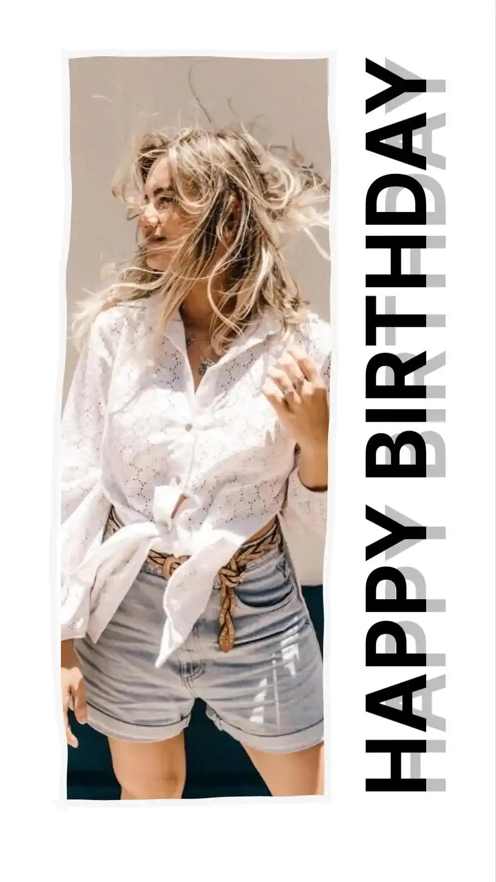
A template is a finished arrangement of text and shapes laid over your own photo. There are 20: Meme, Meme Bar, Quote Card, Caption Bar, Headline, Corner Watermark, Tiled Watermark, Date Stamp, Polaroid, Sale Tag, Just Listed, Invitation, Birthday, Postcard, Thumbnail, Story Headline, Before & After, Recipe, Save the Date and Motivational.
A template locks nothing. Tap Sale Tag, retype the price, drag the tag into the other corner and recolour it to match the shop front. Every piece is an ordinary text or shape layer, exactly like one you added yourself. The template saved you the first five minutes and then got out of the way. Pick a second template later and the editor asks first. Download the current design, switch without saving or keep editing. Your photo stays either way.
A style works on a smaller scale. It changes how one line of text looks and leaves the rest of the design alone. The Text tab carries 20 of them: Neon, Gold Foil, Hollow, Lift, Splice, Echo, Glitch, Retro 3D, Sticker, Highlighter, Subtitle, Stamp, Typewriter Tape, Handwritten Note, Meme, Frosted Label, Gradient Pop, Arc Badge, Chalk and Bold Outline.
Select a line you already typed and tap one. The wording stays put while the look changes around it. Tap a different style a second later and the line changes again, so auditioning six looks on a birthday caption takes about as long as reading their names. With nothing selected, tapping a style adds a fresh line already dressed in it.
Effects
Select any text and a toolbar appears with ten buttons: Edit, Font, Colour, Outline, Shadow, Box, Spacing, Curve, Arrange and Contrast. Here is what sits behind them.
Colour takes a solid fill or a two-colour gradient with its own angle, so a headline can fade from coral at the top into plum at the bottom. Outline sets a width and a colour, then offers a second outer outline around the first. A white ring inside a black one is how sticker lettering survives on any background at all. Shadow has a colour, a blur and an offset. Glow has a colour and a size. 3D gives the letters a solid extruded side with a depth, an angle and a colour of its own. Echo lays copies of the words behind themselves, like a word shouted down a corridor.
Box puts a panel behind the words with its own colour, opacity, padding and corner radius. It can wrap the whole block or hug each line separately, which is the look of television subtitles. A frosted option blurs the photo behind the panel instead of hiding it. Curve bends a line up into an arch or down into a bowl. Rotation, opacity and blend mode (Normal, Multiply, Screen, Overlay or Soft Light) sit alongside lock, duplicate, bring forward, send back and delete.
The type itself gets a size, a weight (Regular or Bold where the family has a bold), italic, underline, strikethrough, UPPERCASE, lowercase and Title Case. Alignment runs left, centre or right. Letter spacing and line height each get a slider. One more switch tiles a line across the entire photo, which is how a watermark gets from one corner to everywhere.
Moving things works the way it does in a design app. Drag to move. Corner handles resize, side handles reflow the text into a narrower or wider column and a separate handle rotates, snapping every 15 degrees. Guides appear when a layer lines up with the centre or an edge. Arrow keys nudge, Ctrl+D duplicates, Delete removes and Ctrl+Z walks back a mistake, with Ctrl+Shift+Z to redo it. To change the words, click a selected line again or just start typing. New text opens ready to type into. Escape lets go. The Layers tab lists every layer. Drag one up or down to change the order. Show, hide, lock, duplicate and delete sit on the same row, which rescues a caption hiding underneath a sticker.
Elements, Borders and Your Logo
Words rarely travel alone. The Elements tab adds 112 emoji stickers across eight groups and 11 shapes. The Layout tab adds 4 borders around the whole image.
The shapes are Rectangle, Rounded, Circle, Line, Arrow, Double Arrow, Speech Bubble, Star, Heart, Burst and Ribbon. Most of them earn their place by holding words. A Speech Bubble turns a caption into dialogue. A Burst behind a price reads as a sale before anyone reads the number. A Ribbon across a corner says new. An Arrow points at the thing the words describe, which in a before and after is usually the whole point.
The borders are Solid, Double, Inset and Polaroid. Polaroid borrows the instant-print frame. A frame like that practically begs for a handwritten date.
Add a logo or image, under Your logo, turns a file from your device into a layer like any other. A PNG with a transparent background sits cleanly on the photo. A JPG logo drags its white rectangle along with it. Resize the logo, fade it and park it in a corner. A bakery can stamp the same small mark on every cake photo it posts without opening anything heavier than a browser tab.
Underneath all of it sits the photo, which has a tab of its own. Replace it, rotate it 90 degrees, flip it or crop it. Choose from 12 looks, Original included, such as Noir, Golden Hour or 90s Disposable. Then fine-tune with 5 sliders for brightness, contrast, saturation, warmth and blur. A second photo can come in as its own layer for a picture in picture. The looks are plain pixel arithmetic rather than a display effect, so a download from Safari on an iPhone matches the preview you were looking at.
Fonts You Can Use Anywhere, Including for Work
Fonts are where free text tools tend to hide the catch. One we looked at lists more than 900 of them and lets a free user choose from 12. Here 112 come built in and 1,946 more sit one search away. Every font the page serves is free for commercial work. A shop flyer, a client thumbnail, a printed menu. All covered.
Three Shelves of Fonts
The first shelf holds 12 system fonts, the same set our collage maker uses: Clean, Neutral, Rounded, Condensed, Book, Fashion, Slab, Typewriter, Console, Script, Handwritten and Poster. They cost nothing to load because they borrow typefaces already installed on your device. The trade is consistency. Handwritten on a Mac and Handwritten on an Android phone can be two different typefaces, since each device fills the name with whatever it has.
The second shelf holds 100 open-source families, served from collagephotoapp.com itself. They sit in groups: Sans, Poster, Serif, Display, Script, Handwritten, Mono, Arabic, Devanagari and More scripts, the last covering Bengali, Tamil, Hebrew and Thai. A font file downloads only when something on screen needs it, never the whole shelf at once. These look identical on every device. Use this shelf when a design has to match across a phone, a laptop and a print.
In the Font panel the first two shelves share one list, grouped by style. Tap All to see every font at once. Tap a group such as Script or Poster to narrow it down.
The third shelf is a library of 1,946 more open-source families behind a button marked Browse more fonts. Search it by name or filter it by style. A font file downloads the moment you pick one. None loads before that. The photo stays exactly where it was.
Why three shelves? Speed and consistency. The first costs nothing to load. The second looks the same on every device and downloads only the families you actually use. The third is there for the rarer job: one particular handwriting face, a retro display cut or a script the built-in set does not cover.
What the Open Font License Lets You Do
Every font on the second shelf carries the SIL Open Font License or Apache 2.0. The third shelf uses the same two, plus the Ubuntu Font Licence on a handful of families. All three allow commercial use. The Open Font License is short and generous. It lets you use, study, copy, merge, embed, modify, redistribute and sell the font as part of something bigger. The one thing it forbids is selling the font file by itself.
The part that matters for a photo with words on it sits in the license FAQ: documents and graphics made with the font remain the maker's own work. The picture belongs to you. Put an open-licensed font on a product photo, a paid ad, a wedding invitation you sell on a craft marketplace or a thumbnail for a monetised channel. All fine.
The famous exception is Impact, the face nearly every classic meme uses. Monotype owns Impact and licenses it to Microsoft, so no free web tool can bundle the file. This editor uses Anton instead, a condensed poster face by Vernon Adams under the Open Font License 1.1. At meme size, in white with a black outline, it does the same job.
The first shelf works differently. System fonts come with your device under its own licence terms. For commercial work where the terms matter, pick from the hosted shelf and the question never comes up.
Bringing Your Own Font File
Brand fonts are the usual reason. Open Your own font in the font panel and pick a .ttf, .otf, .woff or .woff2 file from your device. It loads into the page and never leaves it. Nobody else sees the file and nothing about it reaches our server. A designer can build a client's social graphics in the client's own typeface without installing a thing.
One caution. A font you bought comes with its own licence. The editor cannot read that licence for you, so check that it covers images you publish before the campaign goes out.
Pairing Two Fonts Without a Fight
Two fonts is usually the right number on a photo. Three starts to look like a ransom note.
Give each font a job. The headline gets the personality: a Poster face, a Display face or a Script. The line underneath gets calm: a Sans or a Serif that stays readable when small. Then make the difference obvious. A heavy condensed headline over a light, wide sans works because nobody could mistake one for the other. Two similar sans faces side by side look like an accident, as if the second line lost its formatting on the way.
Size does the rest. Make the headline at least twice the height of the line below it. The eye then knows where to start before anyone tells it.
Two pairings that rarely go wrong. A Poster headline over a Sans caption, for sales, events and thumbnails. A Script name over a Serif date, for weddings, birthdays and invitations. Handwritten fonts need more care than either. They read beautifully for three words and turn into hard work by the tenth.
Making Words Readable on a Busy Photo
A photo is never one colour. Put white words across a summer sky and they read perfectly over the blue, then vanish the moment the line crosses a cloud. The preview looks fine to you because you already know what you typed. A stranger scrolling past at arm's length on a bus has no such advantage.
The 4.5 to 1 Benchmark
The Web Content Accessibility Guidelines, WCAG 2.2, measure readability as a contrast ratio between the text colour and the colour behind it. The scale runs from 1 to 1, white on white, up to 21 to 1, black on white. For normal text the guideline asks for at least 4.5 to 1. Large text, which WCAG defines as 18 point or 14 point bold (about 24 pixels and 18.66 pixels on a screen), needs 3 to 1.
Photos add a wrinkle. W3C failure F83 says text over a background image must contrast with the parts of the image most like the text. An average colour does not count. If your white word crosses a pale cloud, the cloud is what it has to beat.
There is a caveat. WCAG exempts text that forms part of a picture with other significant visual content, so no rule makes a holiday caption fail. We still treat 4.5 to 1 as the benchmark to aim for. The guideline exists because of real eyes: glare on a phone screen, a cracked display, a reader in their seventies. Those eyes look at your Story whether a rule covers it or not.
Reading the Contrast Meter
Select any text and press Contrast. The meter looks at the photo pixels directly under your letters, the ones W3C calls the parts most like the text. It works out the WCAG contrast ratio between each of those pixels and your text colour. Then it reports the worst case.
Worst case here means the 10th percentile. Nine in ten of the sampled pixels do at least as well as the figure you see. An average would flatter the sky and cloud line from earlier, since the blue outnumbers the cloud and pulls the mean up. The 10th percentile catches the cloud.
The figure sits against both lines at once: 4.5 to 1 for normal text and 3 to 1 for large. A big headline that clears 3 but misses 4.5 is fine. A small credit line in the same spot is not. If the text carries a solid box or a thick outline, the meter measures the letters against that instead, since the box or the outline is now the thing touching the letters.
The check runs on your device against the same drawing the download uses. It knows nothing about your photo beyond the pixels, which is exactly the point. It sees what a stranger will see.
Five Fixes, Ranked by How Much Photo They Cost
When the number falls short, the meter offers five one-tap fixes. They are not equal. Each buys contrast by hiding a different amount of the picture, so here they are from cheapest to dearest.
- Black or white. Costs no photo at all. The editor switches the text to whichever of the two reads better against what sits behind it. Try it first.
- Add outline. Costs a thin ring around each letter. A dark outline on light text gives every letter its own private background, which is the whole trick behind meme lettering.
- Add shadow. Costs a soft halo that darkens a little more of the photo than an outline does. It suits elegant type where a hard outline would look cartoonish.
- Add scrim. Costs a band of the photo. A scrim is a gradient laid over the picture from the top, the bottom, the left, the right or all over, with a colour and a strength you control. The photo stays visible through it, only darker where the words sit.
- Add box. Costs everything underneath it. A solid panel behind the words guarantees the number, because the meter then measures the letters against the box. Use it when nothing else passes. It also suits designs that want a label anyway.
A free fix comes before all five: move the words. Drag the line off the cloud and onto the plain blue, then check the number again. The Style tab adds three more tools that work on the photo and never on the text. Tint washes the picture in one colour. Vignette darkens the edges. Background blur softens the photo's detail so the letters stand against a smoother field.
Text Effects and When Each One Earns Its Place
Every effect in the editor exists because some photo needs it. None of them suits every photo. The table is our rule of thumb for each.
| Effect | Earns its place on | Skip it when |
|---|---|---|
| Outline | Memes, stickers, any text over a photo with light and dark patches | The font is thin or ornate, since a thick ring fills the gaps inside letters |
| Second outline | Sticker text that has to read on anything at all | The text is small, where two rings turn the letters to mush |
| Shadow | Serif and script type over a mid-tone photo | The photo is already dark, where a dark shadow disappears |
| Glow | Neon signs, night shots, anything meant to feel lit | Daylight photos, where a glow reads as a smudge |
| 3D depth | Retro titles, posters, thumbnails that need to shout | Whole sentences, where depth on every letter gets heavy |
| Echo | Music posters and one-word titles | Anything read at a glance, since the copies compete with the words |
| Gradient fill | Big, heavy headlines with room to show the change of colour | Thin or small type, where the gradient is too short to see |
| Box | Captions, price labels, subtitles, anything that must pass the meter | Photos where every pixel matters, since the box hides what sits under it |
| Frosted box | Text over a busy photo where a solid box feels too heavy | Tiny labels, where the blur has too little room to show |
| Curve | Badges, round logos, a short line arching over a face | Long lines, where a curve on eight words becomes a rainbow nobody reads |
| Blend mode | Watermarks and text meant to sit inside the photo's texture | Text that must pass the meter, since it borrows the photo's colours |
| Tile | Watermarks on proofs and photos you are selling | Photos you want people to enjoy |
A rule we keep coming back to: one effect per line, two at most. An outline plus a shadow is a classic pair, since each covers the other's weakness. An outline plus a glow plus 3D plus a gradient is a fairground sign. The one-tap styles help here because each arrives as a set that already works together. Start from Bold Outline or Frosted Label and change one thing at a time.
Curve deserves a practical note. Letters on an arc spread apart along the outside of the bend, so a curve reads best on short words in capitals. Arc Badge is the style built for exactly that. The editor also draws curved text one letter at a time along the arc, which breaks the joins in Arabic. The panel warns you when that happens, so keep joined scripts on a straight line.
Placing Text on Stories, Reels and Thumbnails
On a phone, the app paints its own furniture over your picture. A Story carries a progress bar and a profile row across the top with a reply bar along the bottom. Reels stack their buttons down the right-hand side. A YouTube thumbnail wears the video length in one corner. Place text without knowing where those sit and they cover it on the very first view.
Safe Zones in Numbers
Meta publishes one set of figures, in its ads guide for Story placements: keep 14 percent at the top, 35 percent at the bottom and 6 percent on each side free of text. On the editor's 1080 × 1920 Story preset that works out to 269 pixels at the top, 672 at the bottom and 65 on each side. What remains is a box 950 × 979 pixels, which is 45 percent of the frame.
Instagram itself publishes no safe zone for ordinary Stories or Reels. TikTok hands out template files instead of numbers. That leaves Meta's percentages as the only published figures. Meta wrote them for ads.
For an ordinary Story, our roundup of Instagram Story maker apps gives a looser band. The top and bottom 250 pixels carry Instagram's own interface, which leaves 1080 × 1420 in the middle for anything people need to read. Our rule: design to the looser band on everyday Stories and to Meta's box on anything you might later run as an ad. The Safe zones switch in the top bar draws Meta's guide over any 9:16 canvas, so you see the margins while you type.
Size matters as much as position. Instagram shows a 1080-pixel post across the full width of the phone, so your words shrink by the same ratio as the picture. The honest test is to zoom the editor out until the photo is about the size it will be on a phone, hold it at arm's length and read. If you squint, go bigger.
Sizes by Platform
The Size tab carries 22 presets plus Original and Custom. Every card shows your own photo cropped to its shape, so you see the crop before you pick it. These are the ones built for posting.
| Platform | Ratio | Pixels |
|---|---|---|
| Instagram square post | 1:1 | 1080 × 1080 |
| Instagram portrait post | 4:5 | 1080 × 1350 |
| Instagram tall portrait post | 3:4 | 1080 × 1440 |
| Instagram landscape post | 1.91:1 | 1080 × 566 |
| Instagram Story or Reel | 9:16 | 1080 × 1920 |
| YouTube video thumbnail | 16:9 | 3840 × 2160 |
| YouTube Shorts thumbnail | 9:16 | 2160 × 3840 |
| Pinterest pin | 2:3 | 1000 × 1500 |
| Link preview image | 1.91:1 | 1200 × 630 |
Instagram keeps feed photos between 1.91:1 and 3:4, 1080 pixels wide and between 566 and 1440 tall, according to its help centre. The 3:4 shape became a standard option on 29 May 2025. Reels run from 1.91:1 up to 9:16. Instagram crops a photo outside those shapes, so crop it yourself first and decide what goes.
YouTube now asks for 3840 × 2160 thumbnails on videos and 2160 × 3840 on Shorts, as JPG or PNG, up to 2 MB when uploading from a phone and 50 MB from a desktop, per YouTube Help. Until late 2025 the answer was 1280 × 720. Older size charts still say so. A 3840 × 2160 PNG with a photo behind the text will usually overshoot 2 MB. Save it as a JPG with the quality slider a notch or two down. Uploading from a computer lifts the limit to 50 MB anyway.
When the photo does not match the preset, open Layout and choose Crop to fill, then drag the photo to pick what stays. Fit inside keeps every pixel instead, filling the leftover space with a colour or a blurred copy of the photo. Layout can also add space above, below or beside the photo. That turns an awkward landscape shot into a tall post with a caption bar that never covers anyone's face.
One old worry can go. Facebook's rule limiting ad images to 20 percent text was retired in September 2020. It still turns up in advice threads. Ignore it and design for the safe zones instead.
Memes, Quotes, Watermarks and Captions
Four jobs come up again and again. Each one has conventions worth knowing before you start typing.
Memes
The classic meme is an image macro: a photo with one line at the top and one at the bottom, set in Impact in white with a black outline. Geoffrey Lee designed Impact in 1965, decades before anyone captioned a cat with it. The white and black pairing is why the format works on any photo. The outline brings its own contrast.
The Meme template sets that up in one tap, with Anton standing in for Impact. Meme Bar is the other common layout: black words on a white bar above the photo. Already typed something? The Meme style in the Text tab turns any line into meme lettering. Keep each line short. People read a meme in the second before the thumb moves on, so a top line of five or six words beats a paragraph every time.
Quote Cards
A quote card is the opposite of a meme. It asks for a slow read. The Quote Card and Motivational templates give you a starting layout to retype. Four habits make them work.
Pick a photo with a quiet area (sky, a wall, still water, a blurred background) and set the quote there. Size the name underneath at roughly half the height of the quote so nobody mistakes it for part of the saying. Reach for a scrim before a box when the photo is the reason people will stop, since a scrim keeps the picture visible.
And credit the person you quote by name. A quote without a name is how misattributed sayings spread.
Text Watermarks
A watermark tells people who made a photo and makes it a little harder to pass off. The editor offers two kinds. Corner Watermark puts a small name or handle in one corner. It is discreet and easy to crop out. Tiled Watermark repeats the text across the whole photo, which is much harder to remove and much harder to enjoy. A sensible split: tile the proofs you send a client for approval. Use a corner mark on photos you post.
Three controls make a watermark look deliberate. Opacity lets the photo show through, so lower it until you notice the picture before the name. Blend mode set to Overlay or Soft Light makes the letters take on the photo's own light and shade instead of sitting on top. Lock stops you dragging the mark by accident while you work on everything else. Any line of text can tile, so a handle, a website address or a copyright line all work.
Watermarking a whole shoot? Batch mode, further down, puts the same mark on up to 50 photos in one go.
Captions
The word caption means two different things. A post caption is the text you type into Instagram or Facebook under the picture. It stays text, so people can search it, copy it and hear it read aloud by a screen reader. An overlay caption lives in the pixels. It survives screenshots, reposts and downloads. It also loses what makes text useful: nobody can search it, copy it or have it read aloud unless you repeat it somewhere.
Good posts use both. Put the one line that must survive a repost on the photo: a name, a date or a price. Write the rest in the post caption. The Caption Bar and Date Stamp templates handle the first part. For a caption outside the photo altogether, the Layout tab adds space around the picture, so the words never sit on anyone's face.
Writing in Arabic, Hindi, Chinese and Other Scripts
Type Arabic into an editor that draws one letter at a time and the word falls apart. Each letter comes out in its standalone form, spaced like beads on a string.
Arabic runs right to left and joins most of its letters to their neighbours, changing each letter's shape by its position in the word. The W3C's Arabic layout requirements spell out why drawing letters one by one breaks those joins. Devanagari, the script of Hindi and Marathi, has its own demands. Consonants fuse into conjuncts, like the स्त in नमस्ते. Some vowel signs come after a consonant when you type and before it when you read: in हिंदी the short i sign follows ह on the keyboard and sits to its left on the page.
This editor draws each straight line as a whole string, so your device's own text shaping does the joining and the reordering, just as it does in any other app. Type or paste right-to-left text and the editor detects the direction automatically. The hosted shelf carries Arabic and Devanagari groups, plus Bengali, Tamil, Hebrew and Thai under More scripts, so the letters look the same on every device.
When we counted on 26 September 2026, 57 families on the third shelf supported Arabic and 62 supported Devanagari, so it widens the choice a long way. Chinese, Japanese and Korean use your device's own fonts by default. For a look that matches everywhere, search the third shelf for a Noto family such as Noto Sans SC, Noto Sans JP or Noto Sans KR.
The editor looks after one detail by itself. It leaves letter spacing off for joined scripts like Arabic and Hindi, since extra space would pull the letters apart. Curves are the one thing to avoid. A curve places letters one at a time, so keep joined scripts on a straight line.
Adding the Same Text to Many Photos
An estate agent with 18 listing photos and one Just Listed banner has a dull afternoon ahead in most editors. Of the 13 free text tools we checked, two offered text on many photos at once. Both charged for it. Here it is free.
Open Batch and add up to 50 photos. The text, shapes and stickers on your current design go onto each one. The editor stores positions as fractions of the canvas rather than as pixels, so a mark placed 5 percent in from the bottom right corner lands 5 percent in on a tall portrait and on a wide landscape alike. Step through the set to check each photo. Then download one ZIP with every photo at its own resolution, numbered add-text-to-photo-collagephotoapp.com-1, -2 and on up.
The editor handles the photos one at a time, never all at once. That is what keeps a long batch inside a phone's memory.
Design on your most awkward photo first. If the words read on the busiest, brightest picture in the set, they will read on the rest. Run the contrast meter there before you start the batch.
Keeping Text Crisp When You Save
Text is the least forgiving thing you can put in a picture. A soft edge on a leaf goes unnoticed. A soft edge on a letter looks like a mistake. A few choices at save time decide which one you get.
PNG or JPG for Text
JPG throws detail away to make files small. Text is where the loss shows. The Wikipedia article on JPEG notes that its artefacts are "especially noticeable around sharp corners" and names text as a good example. PNG is lossless. Every pixel of every letter comes out exactly as drawn. The cost is size: a full-resolution photo saved as PNG can weigh several times what the same photo weighs as a JPG.
Our rule of thumb. Mostly words on flat colour, like a quote on a solid box or a sale graphic: PNG. Mostly photo with a line of text on it: JPG with the quality slider high, around 90, where the letters stay clean and the file stays reasonable. WebP sits between the two, usually smaller than JPG at the same quality, with a quality slider of its own. Whatever you pick, save once from the original. Re-saving a saved JPG adds a fresh layer of blur to every edge.
Full Resolution and the Ceiling on Phones
The canvas starts at your photo's own pixel size, labelled Original. The download comes out at that size. A 4000 × 3000 photo leaves as a 4000 × 3000 photo with words on it. Some free tools shrink big photos to 1800 or 4096 pixels without saying so. This one does not.
The only ceiling is the one your device sets. Browsers limit how large an image a page may build in memory. Phones set the lowest limits. Safari on iOS 17 and older refuses anything above 16,777,216 pixels, which is 4096 × 4096 or about 17 megapixels. iOS 18 raised that limit. On iOS 18 and later the editor works up to 33,554,432 pixels, about 34 megapixels. Everywhere else the ceiling is 50,000,000 pixels.
The editor scales a bigger photo down just enough to fit and tells you when it does. Open a 48 megapixel photo on an iPhone and that is what happens. For the full size, open the same photo on a laptop, where the ceiling sits at 50 megapixels. The Download menu also offers sizes smaller than Original, which is handy when a platform will shrink the file anyway.
Printing a Photo With Words on It
Print wants pixels. Adobe calls 300 DPI the general benchmark for photo prints. The Size tab has print presets built at exactly that, each available both ways round.
| Print size | Pixels at 300 DPI |
|---|---|
| 4 × 6 inches | 1200 × 1800 |
| 5 × 7 inches | 1500 × 2100 |
| 8 × 10 inches | 2400 × 3000 |
| A4 (210 × 297 mm) | 2480 × 3508 |
Text size is where printed photos go wrong. No reliable source sets a minimum text size for a photo print. The closest guidance comes from RNIB, the UK sight loss charity, which recommends 14 point type for printed documents and nothing smaller than 12. A point is 1/72 of an inch, so at 300 DPI 12 point works out to 50 pixels of font size and 14 point to about 58. Hold your smallest line against those numbers before an invitation goes to the printer.
Font size and letter height are not the same thing, since the font size includes room for the tails that hang below the line and the strokes that rise above it. The real check is simple. Print a test at the final size on plain paper at home and read it at arm's length. The Invitation and Save the Date templates pair naturally with the 5 × 7 preset.
When a Photo Refuses to Open
The editor opens JPG, PNG, WebP, GIF, BMP and AVIF. A screenshot on your clipboard pastes straight in with Ctrl+V. HEIC is the awkward one. It is the format an iPhone shoots by default. Most browsers cannot decode it.
Safari 17 and later reads HEIC on Mac and iPhone. So does Chrome on iPhone, which uses the same engine underneath. Chrome, Edge and Firefox on Windows and Android cannot. When a HEIC photo will not open, the editor says so and explains the fix instead of failing without a word.
Three fixes, fastest first. On the iPhone, set Settings, then Camera, then Formats to Most Compatible. New photos then save as JPG. For photos you already took, share the photo to yourself, which converts it on the way out. Or open this page in Safari, which reads HEIC directly.
Very large photos are the other snag, covered above: the editor scales them to fit your device's ceiling and says so. Camera RAW files such as DNG are not on the list at all, so export a JPG from your photo app first.
Your Photos, Your Words and Your Location Data
Everything is processed here itself, nothing is uploaded to our servers. The photo goes from your disk into this page. Your device draws the words onto it. The finished file goes into your downloads folder. At no point does the picture cross the internet.
That matters more for text tools than most. People add names, dates, addresses and prices to photos. Most of the 13 free text tools we examined upload the photo to their own cloud first. One draws your text on its own server and sends a finished image back.
Fonts travel the other way. Pick one from the third shelf and your browser downloads that font file. The photo never goes with it.
Then there is the data you cannot see. A phone photo carries EXIF data: the camera model, the moment you took it and often the GPS coordinates of where you stood. Send a photo of your new sofa around with that intact and your home's location travels with it.
This editor draws the download fresh from pixels, so none of that rides along. We tested it in Chrome. A photo carrying GPS coordinates went in. The JPG and PNG that came out had no EXIF block at all. We have not yet repeated the test in Safari or Firefox. Your original on your device stays untouched, so keep it if you want the location for your own archive.
Text in a Picture and Screen Readers
Words drawn into a photo are pixels. A screen reader cannot read them, so a blind follower hears none of the sale price your sighted followers see.
The fix is alt text. The W3C tutorial on images of text is plain about it: the alt text should contain the same words as the image. WCAG success criterion 1.4.5 goes further and prefers real text over images of text wherever possible. On social media, where the image is the post, alt text is how you meet it halfway.
Instagram lets you write custom alt text before you post or after, according to its help centre. Copy your overlay text into it word for word, then add a few words about the photo. For a candle shop it might read: Sale graphic. 30 percent off all candles this weekend, over a photo of lit candles on a shelf.
Contrast is the other half. The contrast meter exists for readers with low vision as much as for anyone squinting on a sunny street. A post that clears 4.5 to 1 and carries honest alt text works for sighted and blind followers alike.
What Most Free Text Tools Leave Out
On 26 September 2026 we went through 13 of the free add-text tools that rank for this search. We read their pages, their help centres and their code. Here is what a typical one does, next to this one. We name nobody, because tools change. We checked every row.
| What you get | This tool | Typical free text tool |
|---|---|---|
| Where the photo goes | Stays on your device | Uploaded to the company's cloud |
| Account to download | Never | Often, stated in the help centre rather than on the page |
| Watermark on free downloads | Never | Some add one unless you pay |
| Fonts free to use | Every font the page serves, commercial use included | One lists more than 900 and unlocks 12 for free users |
| Export size | The photo's full resolution up to your device's ceiling, with a message if it scales | Some shrink big photos to 1800 or 4096 pixels without saying so |
| Daily limit | None | Some cap free saves, one at five a day |
| Contrast check | A meter with the WCAG ratio and five one-tap fixes | Not found on any of the 13 |
| Story safe zones | A 9:16 guide from Meta's published figures | Not mentioned on the three highest-ranking pages |
| Same text on many photos | Up to 50 photos in one free ZIP | Paid on the two tools that offer it |
| Arabic and Devanagari | Drawn as whole words so the letters join | Not mentioned on any of the 13 pages |
| EXIF and GPS data | Left out of the download, tested in Chrome | Not mentioned |
| HEIC photos | Open where the browser can read them, explained where it cannot | Mentioned by two of the 13, in passing |
The pages around those tools run thin too. The longest one we measured came to about 1,140 words and none answered more than six questions. The FAQ at the bottom of this page answers 54.
When the App Goes Further
This editor covers a photo and its words. CollagePhotoApp, our free app for iPhone and Android, goes further with type. In its own words: "Huge fonts library, 5 weights, 43 colors and 43 gradients. Tighten the letters, open up the lines or bend a headline into an arc."
Two app features have no equivalent here. Continuous Text: "Drag your finger and the words follow. Loop them around a face or curl them into a spiral." See Letters: "Big see-through letters with your photos showing through them. Spell out a name, a year or a mood."
The app exports "A PNG at 3x the canvas size in HD" with no watermark. It ships in English, Hindi and Marathi. The store badges above and below this article lead to both versions.
Where This Sits Next to Our Other Tools
Words are often the last step, so the photo may start life somewhere else on this site. The Collage Maker puts several photos in one frame and has its own text tools for a caption across the layout. If you know how many pictures you have, browse the collage layouts by photo count. The Photobooth shoots photo strips with a caption. The Side by Side Photo Maker labels a before and after. Merge Images joins photos in a row, a column or a grid.
For Instagram, the Image Resizer gets a finished picture to an exact size or file weight. The Instagram Carousel Splitter cuts one wide image into swipeable slides. It cannot add text itself, so add the words here first and split the result there. The Instagram Grid Maker slices a photo into profile tiles in posting order. Every one of them runs on your device like this one. The full list of free tools sits in one place.
On the blog, the guide on how to make an Instagram Story collage makes the case for using text sparingly on a Story. The roundup of the 12 best Instagram Story maker apps is where the 1080 × 1420 safe band quoted above comes from. The guide to making a collage on your phone covers the whole job without a laptop. Everything else lives on the blog.
Frequently Asked Questions
Is this add text to photo tool really free?
Yes, the tool is free and nothing is held back for a paid tier. All 20 templates, all 20 text styles and every font cost nothing. So does a full resolution download. There is no daily cap either. The only limits are practical ones: 50 photos per batch and the largest image your device can hold in memory. Your own phone or laptop does the drawing, so we have no per-image server bill to pass on to you.
Do I need to sign up or create an account to download?
You never need an account, either to edit or to download. Open the page, add your words and press Download. The file lands in your downloads folder straight away, with no email box or login wall in front of it. We would have nowhere to keep an account anyway, since your photo never reaches us. Close the tab and the whole session is gone.
Will my photo have a watermark on it?
No, the download carries no watermark, badge or logo of ours. The only words on the image are the ones you typed. Our name does appear in the file name, for example add-text-to-photo-collagephotoapp.com.png. It sits in the name, not in the pixels. Rename the file and every trace of us is gone.
Is my photo uploaded to your servers?
No, your photo never leaves your device. Everything is processed here itself, nothing is uploaded to our servers. The page reads the file from your disk, draws your words over it in your browser and saves the finished image to your downloads folder. We never receive the picture. That leaves nothing of yours on our side to store, share or lose.
Does the downloaded image keep my EXIF data and GPS location?
No, the download carries no EXIF camera data and no GPS location. The editor draws a brand new image from pixels instead of copying your original file, so camera model, lens, time stamp and coordinates all stay behind. We verified this in Chrome with a photo that had its location embedded. Worth knowing before you post a picture taken at home. The original on your device keeps its data untouched.
How many fonts can I use?
You get 112 built-in fonts, a searchable library of 1,946 more open-source families and any font file you own. The built-in set is 12 system fonts plus 100 hosted families. Those are grouped into Sans, Poster, Serif, Display, Script, Handwritten and Mono, with Arabic, Devanagari and More scripts (Bengali, Tamil, Hebrew and Thai) for other writing systems. A font file downloads only when you pick it, so the page stays light. None of them sits behind a paywall.
Can I use these fonts for commercial work?
Yes, every hosted font and every family in the font library is free for commercial use. They ship under the SIL Open Font License or Apache 2.0, plus the Ubuntu Font Licence on a handful of library families. The OFL lets you use, copy, modify, embed, redistribute and even sell a font as part of other work. It only forbids selling the font by itself. Its FAQ confirms that images you make with the font remain your own work. Poster, product shot, paid ad, all fine. The system fonts belong to your device and a font you upload carries whatever licence you bought it under.
Why is there Anton instead of Impact for memes?
Impact is a commercial typeface we are not allowed to bundle, so memes here use Anton, a free font with the same tall, heavy build. Geoffrey Lee designed Impact in 1965. Monotype owns it and licenses it to Microsoft, which is why it comes with Windows but cannot ship inside a website. Vernon Adams drew Anton and released it under the SIL Open Font License 1.1. Set it in white capitals with a black outline and few people will spot the swap. Impact already on your computer? Load its file through Use your own font.
Can I upload my own font?
Yes, Use your own font loads any .ttf, .otf, .woff or .woff2 file from your device. The font goes into this page and never leaves it, so nobody on our side ever sees the file. That matters for a paid brand font whose licence forbids passing the file around. You are not passing it anywhere. Your licence still decides how you may use the images you make with it.
Why does the same font look different on my phone and my laptop?
The 12 system fonts use typefaces already installed on your device, so Clean on a Mac can be a different font from Clean on an Android phone. Windows, macOS, iOS and Android each ship their own set. A name like Handwritten or Typewriter describes a style. Each device fills it with the closest font it has. The upside is speed, since nothing downloads. When a design must look identical everywhere, switch to one of the 100 hosted families. Those arrive as real font files, so a phone and a laptop draw the same letters.
Can I write in Chinese, Japanese or Korean?
Yes, Chinese, Japanese and Korean text works, drawn with your device's own CJK fonts or a Noto family from the font library. Phones and computers already carry fonts for these scripts, so characters appear as you type. For a look that matches on every device, search the font library for Noto Sans or Noto Serif and pick the JP, KR, SC or TC version. SC is Simplified Chinese. TC is Traditional.
What contrast ratio should text on a photo have?
Aim for a contrast ratio of at least 4.5:1 between normal text and the photo behind it. Large text can drop to 3:1. Those are the WCAG 2.2 benchmarks from the W3C. Large means 18 point or 14 point bold, about 24 and 18.66 pixels. For scale, black on white scores 21:1, the highest possible. Strictly, WCAG exempts text that is part of a picture with other significant visual content. So treat 4.5:1 as the target to aim for rather than a legal rule. It still separates words people read at a glance from words they squint at.
How does the contrast meter work?
The contrast meter samples the photo pixels directly under your selected text and reports the worst-case WCAG ratio against 4.5:1 and 3:1. It follows W3C failure F83, which says text over an image must contrast with the parts of the picture most like the text. So instead of an average it shows the 10th percentile, a worst case that catches the one bright cloud behind a white word. With a solid box or a thick outline, the meter measures against that instead. One-tap fixes help when it falls short: Add outline, Add shadow, Add box, Add scrim and Black or white. The last picks whichever reads better.
How do I make text readable on a busy background?
Move the words onto the quietest part of the photo, then calm what is behind them. Sky, a plain wall or an out-of-focus background beats a crowd of detail. No quiet patch? Open Style. A Scrim fades a gradient in from any edge. Tint washes the whole photo in one colour, Vignette darkens the corners and Background blur softens the detail. These tools change the photo and never touch the text. Then check the contrast meter. Still under 4.5:1? Add an outline or a box.
Outline, shadow, box or scrim: which makes text easiest to read?
Use a shadow on calm photos, an outline or a scrim on busy ones and a box when nothing else passes. A shadow is the gentlest fix. It lifts letters off a background that is already fairly even. An outline gives every letter a hard edge that survives almost any photo, which is why memes use it, though it can swamp a thin font. A scrim darkens one side of the photo with a gradient, so the letters stay clean. A box puts the text on a flat colour you choose, which makes any ratio possible. The contrast meter then measures against the box itself.
How do I curve text on a photo?
Select the text, tap Curve on the toolbar and drag to bend the line up or down. The Arc Badge style gives you a curved line in one tap. Curves suit short phrases: a name arching over a head, a place name along the bottom of a round badge. Pair one with the Circle shape from Elements for a stamp look. A full sentence on a steep curve gets hard to read, so keep the bend gentle for anything longer than a few words.
How do I make neon text?
Tap Neon in the Text tab for a ready-made glow, then tune the glow colour and size in the text controls. Tap it with a text layer selected and the words you already typed take on the look. Neon only convinces against darkness. On a daylight photo, drop a dark Tint or a Scrim behind the words first. Otherwise the glow just looks like a smudge. Pink, cyan and lime read most like real sign tubing. A rounded, even-weight font helps too.
How do I make 3D text?
Tap Retro 3D in the Text tab, then set the depth, angle and colour of the 3D side in the text controls. The letters gain a solid side, drawn at the angle you choose, so the words look like blocks standing off the photo. Bright letters over a darker side give the old arcade look. Keep the depth modest on small text. Too deep and thin letters turn to mush. For a flatter take, Echo repeats the words in offset copies behind themselves.
Can I fill text with a gradient?
Yes, any text can take a two-colour gradient fill at an angle you choose. The Gradient Pop style sets one up in a tap. For your own, open Colour on the selection toolbar, pick two colours and set the angle. The angle decides whether the colour runs across the words or down through the lines. Watch the darker end on a dark photo. A fade from white to pale yellow reads the whole way along. A fade into dark grey disappears halfway through the word.
How do I make hollow text with only an outline?
Tap the Hollow style to get letters drawn as outlines only, with the photo showing through the middle. Set the outline width and colour to suit the picture. A second outer outline adds a ring around the first, which helps a lot on busy photos. Hollow text needs a big, heavy font at a large size. A poster face works. A thin script in outline form practically vanishes. Check the contrast meter afterwards, since the outline carries all the contrast.
How do I highlight text line by line?
Add a background box and switch it to line by line, so each line gets its own snug block of colour instead of one big rectangle. The Highlighter style sets this up in one tap. You control the box colour, opacity, padding and corner radius. Line by line hugs a short line and a long line differently, which looks deliberate on quotes and captions. Turn on frosted blur and the photo behind each block goes soft, like a label on frosted glass. The Frosted Label style starts you there.
What do blend modes do to text?
Blend modes decide how the text colour mixes with the photo underneath instead of simply covering it. Normal paints the text on top. Multiply darkens, so dark letters look printed into paper, brick or fabric. Screen does the reverse: light letters glow and black parts drop out. Overlay and Soft Light let the photo's texture show through the letters, with Soft Light the gentler of the two. Blended text almost always scores lower on the contrast meter, so check it before you download.
What size should an Instagram post with text be?
Use 1080 by 1350 pixels (4:5) or 1080 by 1440 (3:4) for a portrait post, the tallest shapes the feed shows. Instagram keeps feed photos between 1.91:1 and 3:4 at 1080 pixels wide, so anywhere from 566 to 1440 pixels tall. Instagram made 3:4 its standard on 29 May 2025. Square is 1080 by 1080. Every one of these is a preset under Size. A taller frame gives words more room without shrinking them. To spread one design across swipes, use the Instagram Carousel Splitter. To spread it across your profile, use the Instagram Grid Maker.
Where is the safe zone for text on Instagram Stories and Reels?
Keep text out of the top 14%, the bottom 35% and 6% at each side of a 9:16 frame, the margins Meta's Story ad guide asks for. On a 1080 by 1920 Story that is about 269 pixels at the top, 672 at the bottom and 65 per side. Instagram publishes no safe zone for ordinary Stories or Reels, so the ad numbers are the most cautious guide around. Turn on Safe zones in the top bar to see them on the canvas. Our roundup of Instagram Story maker apps uses a looser 1080 by 1420 band, clear of the top and bottom 250 pixels.
What size is a YouTube thumbnail?
YouTube asks for 3840 by 2160 pixels for a video thumbnail and 2160 by 3840 for a Shorts thumbnail, as JPG or PNG. The file limit is 2 MB from a phone and 50 MB from a computer, according to YouTube Help. Until late 2025 the standard was 1280 by 720, which is why older guides still quote it. Both sizes sit under Size as presets. The Thumbnail template starts you off with huge outlined words and an arrow. Search results show thumbnails at postage-stamp size, so zoom out and check the words still read.
What size should a Pinterest pin with text be?
Make pins 1000 by 1500 pixels, the 2:3 shape Pinterest recommends. Pinterest says pins taller than 2:3 might get cut off in the feed, so this shape is the safe one. It is a preset under Size. On a phone, pins sit two to a row in a narrow column, so text that looks huge on a laptop shrinks fast. Zoom out in the editor to check your headline survives before you pin it.
What is the safe zone for text on TikTok?
TikTok publishes no safe-zone numbers, only downloadable template files, so any exact pixel figure you read elsewhere is someone's own measurement. The app runs its caption along the bottom and its like, comment and share buttons down the right edge. Keep words in the upper middle of the frame. Meta's 9:16 Story ad guide makes a sensible stand-in: clear the top 14%, the bottom 35% and 6% at each side. Switch on Safe zones in the editor to see those margins.
Does Instagram penalise photos with text on them?
Instagram has never published a rule that marks down a photo for carrying text. Much of the worry traces back to Facebook's 20% rule, which limited text on ads and ended in September 2020. The real risk is simpler. People scroll past words they cannot read, like small type on a busy photo or a line hidden under the Reels buttons. Run the contrast meter and switch on Safe zones for anything 9:16. Our guide to making an Instagram Story collage makes the case for using text sparingly.
Does Facebook still have the 20% text rule for images?
No, Facebook retired its 20% text rule for ads in September 2020. Under the old rule an ad reached fewer people when text covered more than a fifth of the image. It only ever applied to ads, never to ordinary posts. No percentage limits the text on an image today. What still matters is whether someone scrolling past can read it, so keep the words short and check them on the contrast meter.
How do I make a meme with top and bottom text?
Pick the Meme template, type over the placeholder lines and download. The template follows the classic image macro: white capitals with a black outline, one line at the top and one at the bottom, set in Anton. That look comes from Impact, a 1965 typeface. Anton is the free stand-in. For the newer format with the words on a plain strip above the picture, try Meme Bar. Size can also add space above the photo. Keep each line short. A meme gets one glance.
How do I make a quote image?
Start from the Quote Card template, paste the quote and swap in your own photo. Quotes read best over a quiet photo with a Scrim or Tint underneath. Set the words in a serif or a script, then add the name as a smaller Caption from the Text tab. Break a long quote by hand so each line ends where you would pause reading it aloud. For one short line, centred and calm, try the Motivational template.
How do I add a text watermark to my photos?
Use the Corner Watermark template for a small mark or Tiled Watermark to repeat your name across the whole photo. Any text layer can tile: switch on tile across the whole photo in its controls. Then lower the opacity until the photo reads first and the mark second. A corner mark is easy to crop off. A tiled one survives cropping, which matters for proofs you send a client before payment. Add your logo from Elements if you have one. A PNG with a transparent background comes in as its own layer. Batch then stamps the lot on up to 50 photos at once.
What is the difference between a caption and text on the photo?
A caption is the text you type under a post on Instagram, Facebook or TikTok, while text on the photo is drawn into the pixels themselves. Captions stay searchable and editable after posting. Screen readers read them aloud too. Text on the image travels with the picture into screenshots, reposts and group chats. Nobody can edit it or copy it as text, though. Use both. Put the hook on the image and the detail, hashtags and links in the caption. For a caption that must stay with the picture, add space below the photo in Size. The Photobooth tool prints a caption under its strip the same way.
Can I add Arabic or Hebrew text that reads right to left?
Yes, the editor detects right-to-left text automatically, so Arabic, Hebrew, Persian and Urdu lines run from the right as they should. Arabic letters also change shape to join their neighbours, which the W3C's Arabic layout requirements spell out. Drawing one letter at a time breaks those joins. Keep Arabic straight with letter spacing at zero. Wide spacing pulls letters apart and Curve places one letter at a time. The hosted shelf has an Arabic group. Hebrew sits under More scripts. On 26 September 2026 the font library held 57 families with Arabic support.
Will Hindi text come out correctly?
Yes, Hindi set in a Devanagari font keeps its conjuncts and vowel signs where they belong. Devanagari joins consonants into conjuncts and writes some vowel signs, like the short i, before the consonant they follow in speech. Drawing one letter at a time scrambles both. Pick a family from the Devanagari group on the hosted shelf. The font library listed 62 Devanagari families on 26 September 2026. Marathi and Nepali use the same script, so those fonts cover them too. Keep the line straight and the spacing at zero, since Curve places one letter at a time.
Can I use emoji in my text?
Yes, type or paste emoji straight into any text layer. They draw in your device's own emoji style: Apple's on an iPhone or Mac, the Android set on most Android phones, Microsoft's on Windows. The download bakes in exactly what you see on screen. So the same design made on two devices can end up with two different smiley faces. For emoji you can move, resize and rotate on their own, the Elements tab has 112 emoji stickers.
Can I add the same text to many photos at once?
Yes, Batch puts your current text, shapes and stickers on up to 50 photos and downloads them all in one ZIP. Design the first photo, open Batch and add the rest. Step through each one to check nothing lands on a face, then download. Every photo keeps its own resolution inside the ZIP. The editor handles one photo at a time, which keeps a phone from running out of memory halfway through a wedding album. It suits watermarking a whole shoot or labelling a product range.
What happens when the photos in a batch are different shapes?
Each photo keeps your layout in proportion, because the editor stores positions as fractions of the canvas instead of fixed pixels. A caption placed a tenth of the way up a landscape shot sits a tenth of the way up a portrait one too. Proportion cannot solve everything. A long line that fits a wide photo may crowd the edges of a tall one. That is why Batch lets you step through every photo before you download the ZIP. Grouping similar shapes into one batch saves the most fiddling.
Should I save a photo with text as PNG or JPG?
Choose PNG when the text matters most, since PNG is lossless and keeps letter edges crisp. JPG compression leaves small artefacts that show up most around sharp edges. Wikipedia's JPEG article names text as a good example. The trade is file size: a big photo saved as PNG can be several times heavier than the same picture as JPG. For a feed post, a JPG with the quality slider near the top is usually fine. For a flyer, a logo on plain colour or anything you will edit again, use PNG.
Can I download as WebP?
Yes, Download offers WebP next to PNG and JPG, with a quality slider for WebP and JPG. WebP usually comes out smaller than a JPG of the same visual quality, which helps a website or blog load faster. Every current browser opens it. Some desktop apps and print services still expect JPG or PNG, so use one of those for files that leave the web. The same dialog can shrink the export from Original to a smaller size. To hit an exact file size in KB, run the result through the Image Resizer.
How do I add text to a photo without losing quality?
Leave the canvas on Original and download as PNG to keep every pixel of your photo. The editor starts at your photo's own size and exports at full resolution, limited only by what your device can hold. The preview on screen is a lighter copy, at most 2,048 pixels on its long edge, so dragging stays smooth. The download is drawn fresh at full size. If you need JPG, keep the quality slider high. Some free editors shrink big photos to 1,800 or 4,096 pixels without saying so. This one tells you if it has to scale anything.
Why was my large photo scaled down on my phone?
The editor scales a photo down only when it is bigger than your browser can safely hold. A message tells you when that happens. On iOS 17 and older the cap is 16,777,216 pixels, a 4096 by 4096 square. On iOS 18 and later the editor allows 33.6 megapixels. Every other browser gets 50. A standard 12 megapixel phone photo fits under all three. A 48 megapixel shot gets scaled on an iPhone. Open that one on a computer to keep its full size.
How big should text be on a photo printed at 300 DPI?
At 300 DPI, give small text a font size of at least 50 pixels, the same as 12 point type. No official minimum exists for photo prints. The closest guide comes from the RNIB, the UK sight loss charity, which recommends 14 point for printed documents and no smaller than 12. At 300 DPI one point is about 4.2 pixels, so 14 point is roughly 58. Those numbers assume arm's length. People stand further from a print on a wall, so go bigger. Size has 4x6, 5x7, 8x10 and A4 presets at 300 DPI. For several photos on one print, the Collage Maker exports at 300 DPI too.
Why won't my HEIC photo open?
HEIC opens only where the browser can decode it: Safari 17 or later on a Mac or iPhone, plus Chrome on iPhone, which uses the same engine. Chrome, Edge and Firefox on Windows and Android cannot read HEIC, so the editor shows a message explaining what to do instead. On an iPhone, go to Settings > Camera > Formats > Most Compatible and new photos save as JPG. For photos you already took, share one to yourself or open this page in Safari.
Can I add text to a PNG and keep the transparent background?
Yes. Open the PNG, then pick Transparent under Layout, in the Around the photo setting. The clear parts stay clear, your words sit on top and a PNG or WebP download keeps the transparency. JPG cannot store transparency at all, so a JPG download fills those parts with white. An ordinary phone photo has no transparent areas, so this only matters for logos, product cut-outs and stickers. To lay a see-through logo over a photo instead, open the photo first and bring the PNG in with Add your logo in Elements.
How do I add text to a photo on iPhone?
Open this page in Safari on your iPhone, pick a photo, add words from the Text tab and tap Download. There is nothing to install. The tabs sit in a dock along the bottom of the screen and you drag text with a finger. Safari saves downloads to the Downloads folder in the Files app. From there, share the image and choose Save Image to put it in Photos. HEIC photos open in Safari 17 and later. On iOS 17 or older, photos above 16.8 megapixels get scaled to fit.
How do I add text to a photo on Android?
Open this page in Chrome, pick a photo from your gallery, add words from the Text tab and tap Download. Nothing installs and nothing uploads. The tabs sit in a dock along the bottom. Drag text with a finger and use the corner handles to resize it. The finished image lands in your Downloads folder. Photos up to 50 megapixels export at full size. If your camera saves HEIF photos, switch it back to JPEG first. Chrome on Android cannot open them.
How do I add text to a photo on a Mac or Windows PC?
Drag a photo onto this page or paste one with Ctrl+V (Cmd+V on a Mac), then add your text and press Download. A computer is the comfiest place to work: the tabs sit in a rail beside the canvas and arrow keys nudge the selected layer. On a Mac, Safari 17 or later opens HEIC photos. On Windows, Chrome, Edge and Firefox cannot read HEIC, so convert those to JPG first. Photos up to 50 megapixels export at full size.
What alt text should I write for an image with text on it?
Put the same words that appear in the image into the alt text, then add a few words on what the photo shows. The W3C images tutorial is clear: when an image shows text, its text alternative must contain the same text. A screen reader cannot read pixels. So a quote card becomes: Quote card, "Salt in the air, sand in my shoes" over a sunset beach. Skip "image of", since screen readers announce images already. Our download carries no metadata at all, so write the alt text wherever you post it.
How do I add custom alt text to an Instagram post?
Tap Advanced settings at the bottom of Instagram's last screen before sharing, then tap Write alt text. Type the words from your image plus a short description of the photo, then tap Done on iPhone or Save on Android. For a post that is already up, tap the three dots above it, choose Edit, then Edit alt text in the bottom right corner. Your text replaces the description Instagram would otherwise generate on its own. Instagram Help covers both routes.
Is there a phone app with text tools?
Yes, CollagePhotoApp for iOS and Android has its own text tools, including Continuous Text and See Letters. The app offers a "Huge fonts library, 5 weights, 43 colors and 43 gradients. Tighten the letters, open up the lines or bend a headline into an arc." Continuous Text works like this: "Drag your finger and the words follow. Loop them around a face or curl them into a spiral." See Letters makes "Big see-through letters with your photos showing through them." Export is "A PNG at 3x the canvas size in HD", with no watermark. The app ships in English, Hindi and Marathi.
Can I edit the text after I download the image?
No, once you download the image the words become pixels, so nobody can retype them like a document. Keep the tab open while you might still change something. Every layer stays editable and undo keeps working until you close it. Download as many versions as you like in the meantime. We store nothing on our side, so closing the tab ends the session. If a typo turns up later, start again from the same photo and template. A redo rarely takes more than a minute.
What keyboard shortcuts does the editor have?
Ctrl+Z undoes, Ctrl+Shift+Z redoes, Ctrl+D duplicates the selected layer and Delete removes it. Arrow keys nudge a layer. To edit its words right on the canvas, double-click a text layer, press Enter or just start typing. Escape deselects. Ctrl+V pastes a photo from the clipboard to start a design. While you drag, guides snap layers to the centre and edges. Rotation snaps every 15 degrees.
Can I undo a mistake?
Yes, tap undo in the top bar or press Ctrl+Z. Redo sits right beside it, on Ctrl+Shift+Z. So try the wild idea. Restyle a finished heading with Glitch, hate it, undo. Two habits save even more trouble. Lock layers you are happy with so a stray drag cannot move them. Hide a layer in Layers instead of deleting it when you might want it back later.